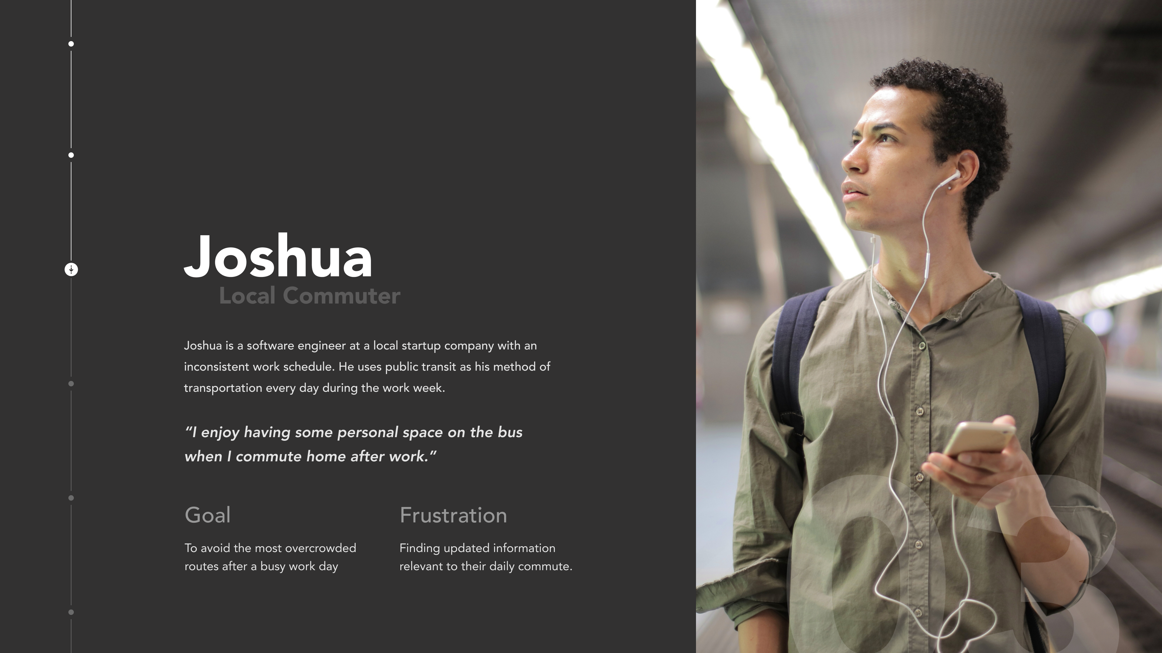
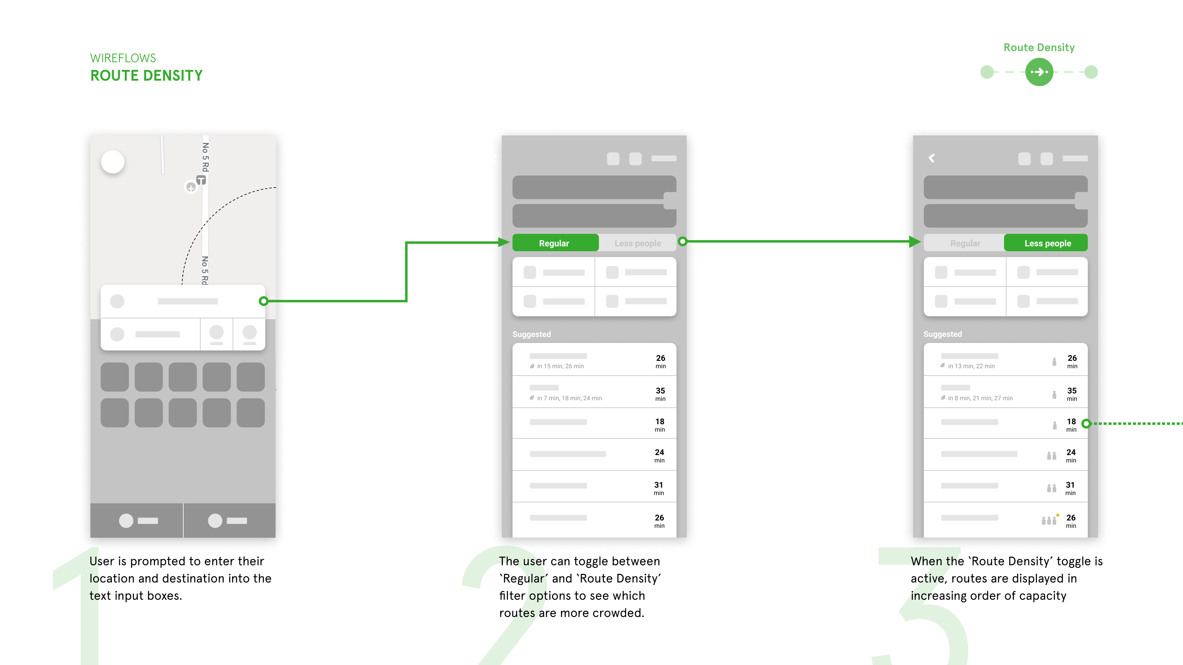
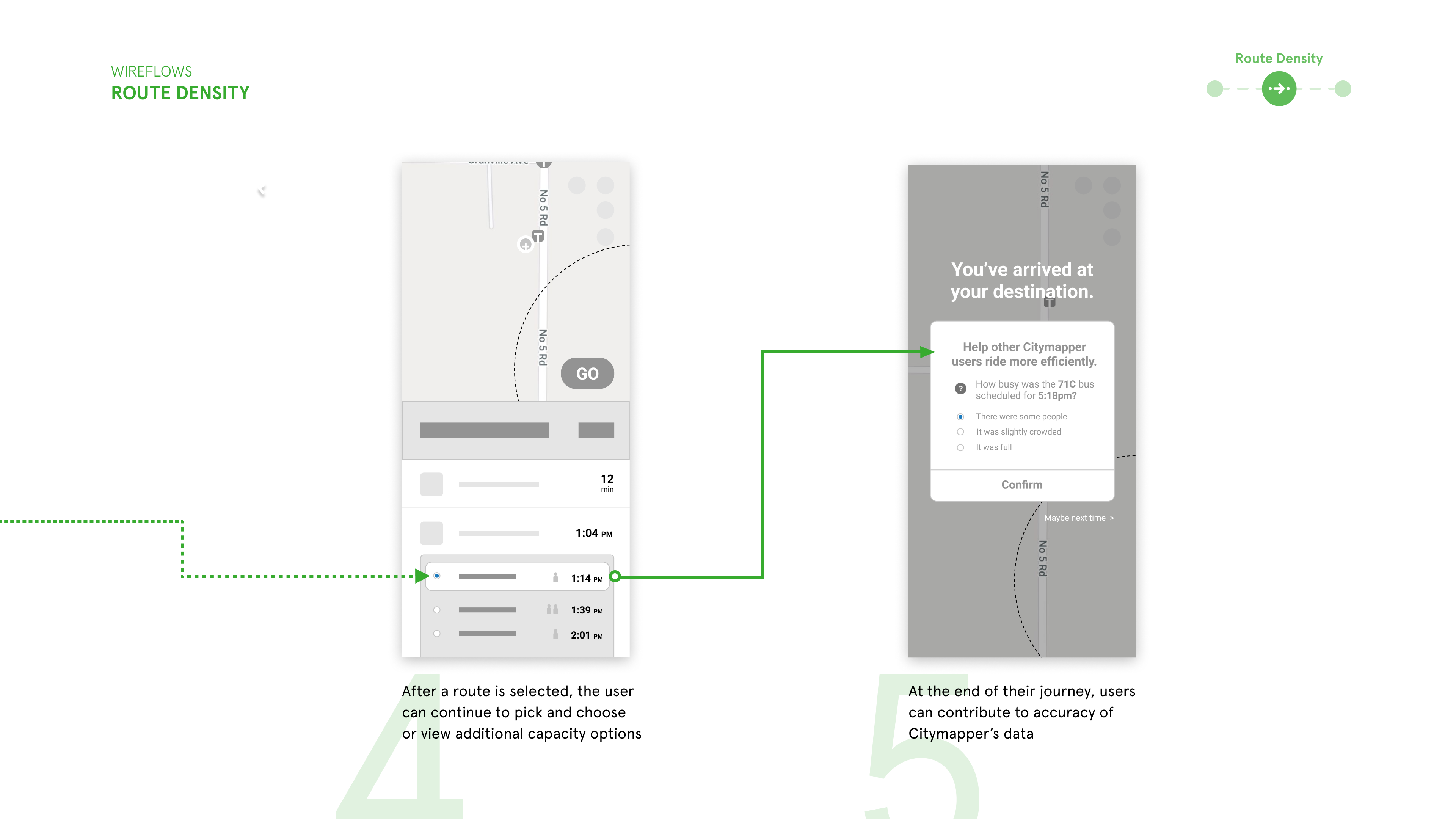
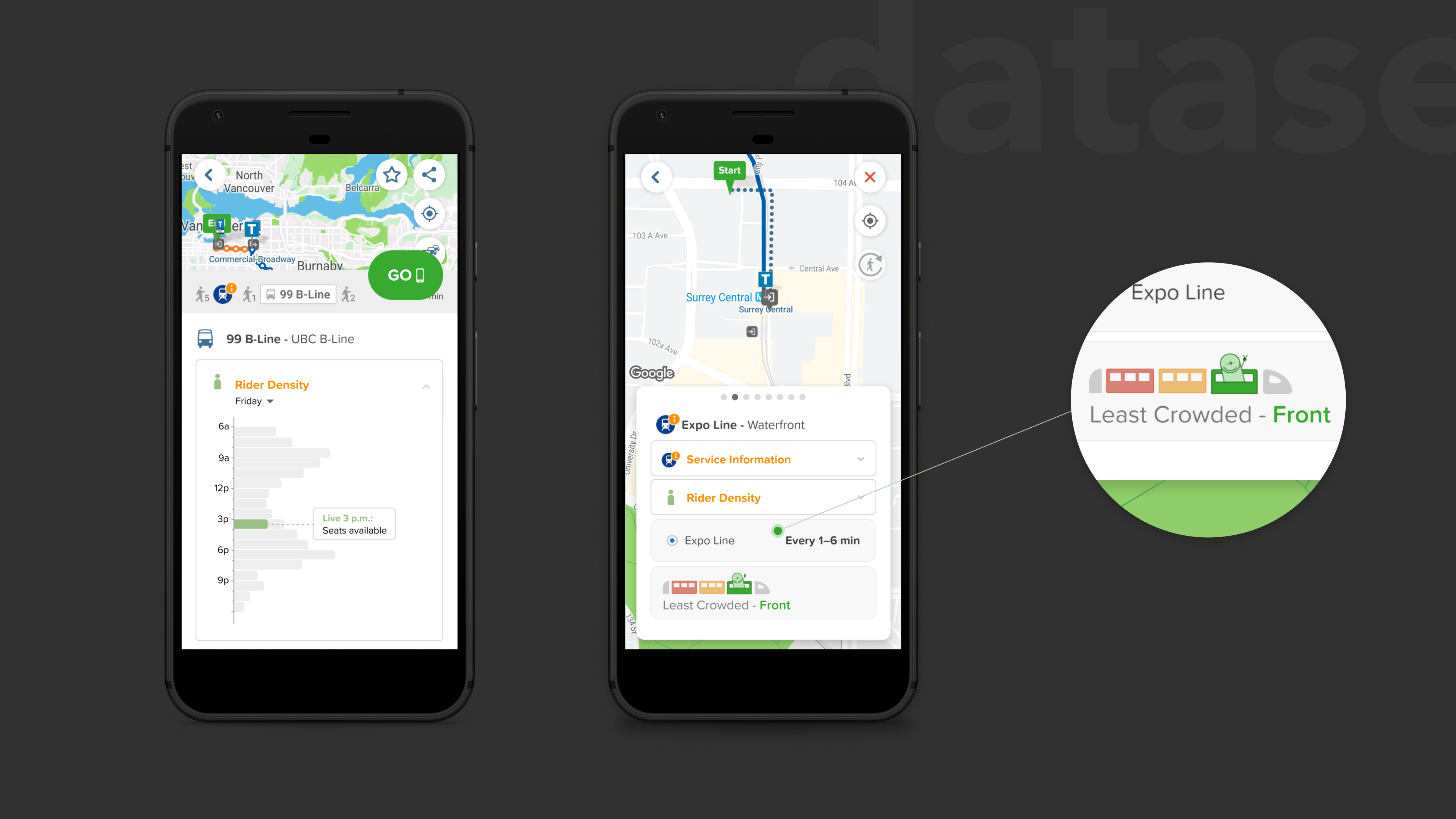
A feature concept that targets transit rider convenience and accessibility by providing updates on transit line density and alternate route suggestions. The feature intends to empower Citymapper users with the tools to better understand their upcoming transport experience and determine the optimal route for their needs.
A 3-week academic case study for a senior interaction design course
Karmen Suen
Serena Ho
UX/UI Design
Interaction Design
Visual Design
Prototyping
Citymapper is a navigation application that improves travel by using data-driven solutions to provide accurate information and multimodal transit features. Citymapper is committed to improving urban mobility centered around human experiences.
The goal of this project was to identify an opportunity for improvement that could be addressed with a conceptualized feature.
As part of the team's research methods, remote user interviews were conducted with individuals familiar with transit applications. The selected users reviewed the Citymapper application and provided responses and concerns with their experiences. From the research, two major findings were discovered.
Presented datasets detailed transit usage, but were complex and difficult to comprehend.
Participants found Citymapper’s user interface to be cluttered with irrelevant information and to be visually overwhelming.
A pattern was identified, demonstrating that users wanted options for a more relaxed and less populated travel route. The focus was to account for travel concerns related to rider density and allow for commuters a wider variety of travel options.
As key user goals and frustrations were identified, a persona for the intended user was formed. This persona was essential in aligning design decisions and ideas.
Integrate Citymapper's Index Data (transit usage data) to be a more relevant and comprehensible part of the user's travel experiences.
Simplify the user interface, so that the data presented is organized consistent to the user’s needs.
As part of the design process, the team created grey-box wireframes that address the potential user goals and concerns. In particular, the goal was to present statistical data with a variety of visually clear methods. As such, iconography, graphs and filtering were some of the main concerns during the development process.
While streamlining Citymapper's existing interface, the added feature allows users to understand route density data with a variety of visual indicators.
A bar graph illustrates the density levels at a given time. Grey bars indicate the predicted or recorded traffic levels, whereas the coloured bar presents the live reports from Citymapper users.
The user can view the breakdown of each mode of transportation before proceeding with their trip. Once the user selects “GO,” they are brought to a screen that displays each mode of travel in separate tabs. Citymapper’s train icons use colour to display density levels in each train car, highlighting the one with the fewest riders.
A route with lower rider density may be suggested to the user, contained within a dropdown tab. Users may choose to take this alternate route or revert to their original choice.
After arriving at their destination, the user is prompted to report how busy the mode of travel is. Confirmation is given to the user once the response is submitted.
One of the largest challenges when designing for this feature was simplifying the complex datasets to be more digestible for the users. The use of colour and visual elements to communicate concepts and data was key for this solution.
Building a new feature for the Citymapper application has taught me to design within an already existing system. This project was an excellent exercise that encouraged me to understand the restrictions and domain of the application, while still creating a design solution that addressed the identified user goals and frustrations.